 Fashion Focus


.jpg)
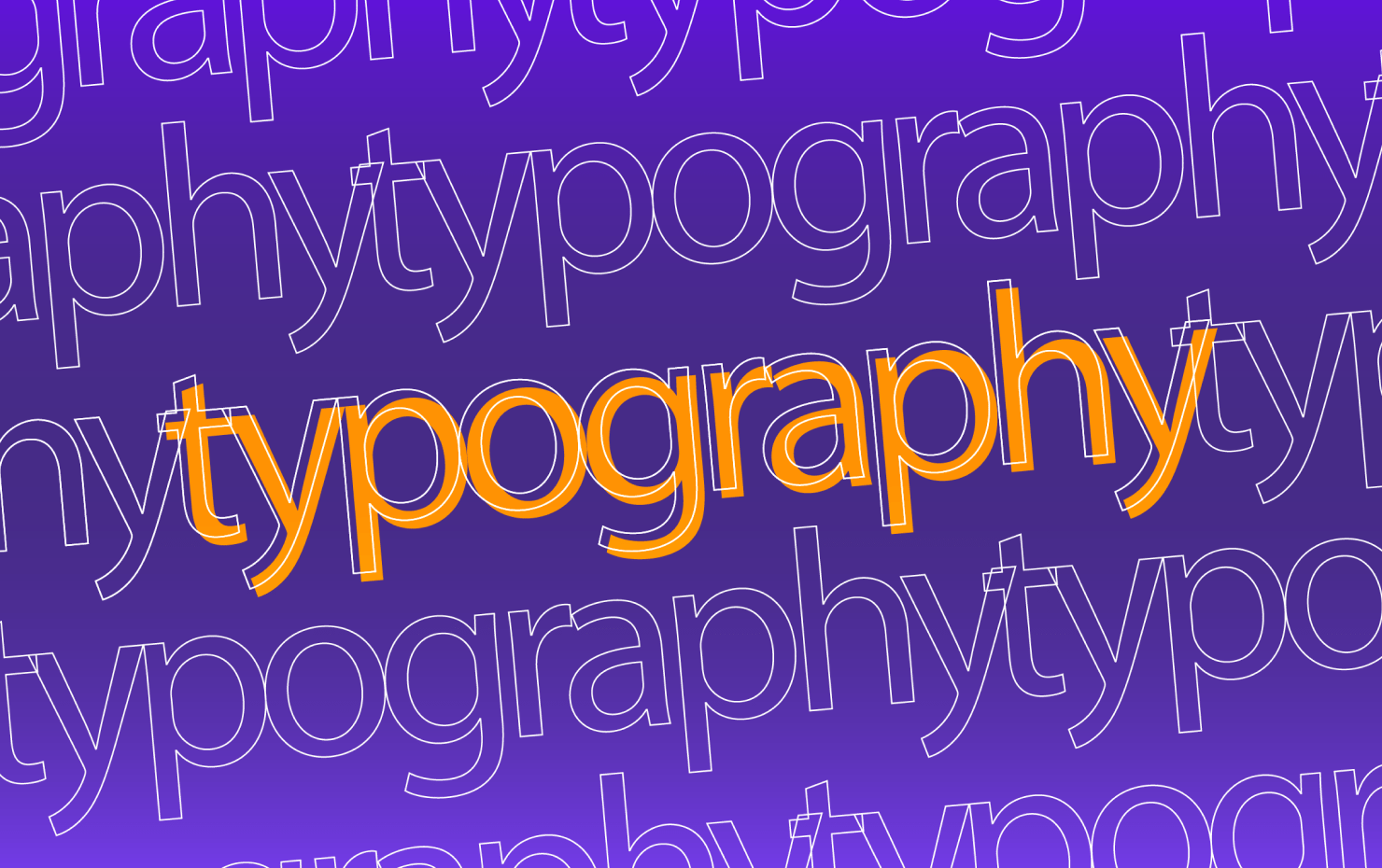
The Dos and Don'ts of Typography in Graphic Design
The Dos and Don'ts of Typography in Graphic Design
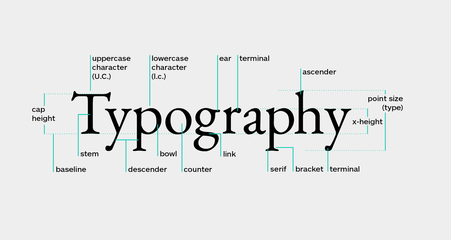
Typography is a foundational element of graphic design, and its impact on the success of a design cannot be overstated. The right choice of font, size, color, and spacing can enhance readability, convey the right tone, and elevate the overall aesthetic. However, missteps in typography can easily undermine the effectiveness of your design. Here are some essential dos and don'ts to guide you in making the most of typography in your graphic design projects.
Do: Choose a Font That Matches the Tone and Purpose of the Design
The font you select should reflect the tone and purpose of your design. For instance, a playful, whimsical project may benefit from a script or decorative font, while a formal, professional design might call for a serif font. Always consider your target audience and the message you want to convey when choosing a font.
Don't: Use Too Many Fonts in One Design
Overloading your design with multiple fonts can create visual chaos and detract from its coherence. Stick to a maximum of three fonts: one for headings, another for subheadings, and a third for body text. Ensure these fonts complement each other to maintain a cohesive look.
Do: Pay Attention to Font Size and Spacing
Proper font size and spacing are critical for readability. Ensure that your font size is appropriate for your audience and the medium of the design. Additionally, pay attention to the spacing between letters (kerning), words, and lines (leading) to ensure the text is easy to read and visually balanced.
Don't: Use All Caps for Body Text
While all caps can be effective for headings or emphasis, they should generally be avoided for body text. All caps can be harder to read and can give the impression of shouting. Instead, use sentence case or title case for body text to maintain readability and a more approachable tone.
Do: Use Color to Enhance Typography
Color can be a powerful tool in typography, helping to highlight important information and add visual interest. Use contrasting colors for headings or key points to make them stand out, but be cautious not to overuse color, which can overwhelm the design.
Don't: Use a Font That Is Difficult to Read
Even if a font looks trendy or stylish, it must be readable. Avoid overly decorative fonts or those with poor spacing, thin strokes, or elaborate details that make the text difficult to decipher. The primary goal is to ensure that your text is easy to read at a glance.
Do: Consider the Overall Layout and Composition
Typography should harmonize with the other elements of your design, such as images, graphics, and the overall layout. Consider how your typography interacts with these elements to create a balanced and visually appealing composition.
Don't: Sacrifice Readability for Style
While it's important to create a visually striking design, readability should never be compromised. Even the most stylish typography fails if your audience cannot easily read and understand the text. Prioritize clarity and legibility, even if it means making some stylistic sacrifices.
Conclusion
Typography is a powerful tool in graphic design, capable of enhancing or undermining the effectiveness of your work. By following these dos and don'ts, you can create typography that is both visually engaging and easy to read. Always consider the purpose and audience of your design, and strive to achieve a balance between style and functionality in your typography choices.
Comments (0)
.jpg)


.jpg)


Sign Up to Our Newsletter

Secure Payment


Follow Us


The Copyright @ 2026 epatternz.com All rights reserved.


